What is mobile computing? What are the challenges of designing for mobile devices and how can we overcome them?
Mobile computing embraces a host of portable technologies that makes internet access on the go not only possible, but integral to everyday life. From notebook computers to personal digital assistants (PDAs) like the Backberry and iPhone, to standard cell phones, mobile computing has become an indispensable way of life (Kayne 2010). The recent success of the ipad adds yet another dimension to mobile computing with several android and windows powered tablet PCs also hitting the shelves. All these different devices, now in everyday use make web design a much more difficult task.

image: www.nacsa.com
Until recently mobile web design may have been something many designers tried to avoid. Today this is no longer an option. With the amount of mobile devices in use, it soon may not be possible to sell a website without a mobile aspect involved. The slice of the market ignored will be too large for any business.
Browser compatibility, screen resolution and size were always a concern but these difficulties provide a much greater challenge when designing for a host of mobile devices and the different browsers they run. “If you thought that developing sites that work on most web browsers such as IE, Firefox, Chrome, and Safari was tough — try developing one for iPhones, BlackBerrys, Palm Pres, Androids, Motorola devices, Nokia devices, and — the list appears bottomless!”(Dawson 2010). Other difficulties include human interface options such as touch screen and multi touch, limited battery life and possibly slower internet data transfer rates.
To make things even more difficult Steve Jobs and Apple have decided that Flash, “The primary goal of Flash has always been to enable cross-browser, platform and device development”(Brian X. Chen 2010), is no longer necessary on the iphone or ipad. Jobs stated that “Flash drains the battery of mobile devices; it’s not very good for multi-touch operation; and its performance, reliability and security are all shoddy”(Schroeder 2010). Many will argue however that Jobs and Apples motives for the move are that “they want to tie developers down to their platform, and restrict their options to make it difficult for developers to target other platforms.”(Brian X. Chen 2010)

image: www.mmktech.net
Designers typically take two different approaches to try to solve the problem of mobile accessibility. The first is to try to alter an existing standard website, which is designed to be displayed on standard devices so it is viewable on mobile devices. This is usually achieved by altering the CSS (cascading style sheet) and in my opinion is not usually very successful. The second option and in my opinion the best is to provide a totally separate website designed specifically for mobile devices. By doing this you can provide the user with a fully tailored mobile site without compromising the original one. This is not the only choice the designer has to make however.
The next thing that we need to consider is the structural code (markup and styles) that goes on behind the scenes.
- Do you go with a mobile-friendly language like WML or the XHTML mobile profiles
- Do you build an app for iPhones, and then one for the Android?
- How does the cost and speed associated with mobile device web browsing affect the way you should develop your design?
- What about modern standards like HTML5 and CSS3?
As you can see it is not a simple process, and many designers are now solving the problem using a simpler solution, a Content Management Systems (CMS). There are many different CMS’s available the most common ones being Drupal, Joomla and Wordpress. These systems, to varying degrees allow you to build powerful easy to use websites. The beauty of these systems is that there are thousands of plugins which can be used in conjunction with them to modify the site to the user’s needs. Among these plugins are several which can be used to create mobile sites.
Kuneri Mobile Joomla is one of these pluginds, claiming to be “compatible with all phones in the world” and to “turn your joomla site into a mobile site instantly”(www.mobilejoomla.com 2010).
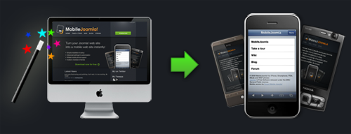
image: www.mobilejoomla.com
Mobile Joomla! Feature highlights
- Advanced User Agent detection (multiple methods i.e WURFL, Compact WURFL, fixed or none)
- Multi site support
- Advanced image adaptation
- Flexible layout settings
- Sub-domain redirection
- Advanced device categorization: XHTML, iPhone, iMode and WAP
- Custom templates per device category
- Menu exclusion per device category
- Fully customizable with different modules and templates
- Compatibility with 3rd party extensions, modules and components
(www.mobilejoomla.com 2010)
So although designing for mobile devices is technically a very difficult process, there are tools and applications available to help make the process a less daunting one. And with the excellent products available it is not always necessary for a designer to start from scratch. After all there is no point reinventing the wheel.
Bibliography
Bibliography
Brian X. Chen, 2010. Adobe Gives Up on Flash for iPhone, iPad | Gadget Lab | Wired.com. Available at: http://www.wired.com/gadgetlab/2010/04/adobe-flash-iphone/ [Accessed November 13, 2010].
Dawson, A., 2010. Mobile Web Design: Best Practices. Available at: http://sixrevisions.com/web-development/mobile-web-design-best-practices/ [Accessed November 13, 2010].
Kayne, R., 2010. What Is Mobile Computing? Available at: http://www.wisegeek.com/what-is-mobile-computing.htm [Accessed November 13, 2010].
Schroeder, S., 2010. Steve Jobs: Flash Is No Longer Necessary. Available at: http://mashable.com/2010/04/29/steve-jobs-flash-is-no-longer-necessary/ [Accessed November 13, 2010].
www.mobilejoomla.com, 2010. Mobile Joomla! for iPhone, Smartphone, PDA, iMode and WAP phones. Available at: http://www.mobilejoomla.com/ [Accessed November 15, 2010].